Booklets menstrual hygiene companies made
for girls, women and teachers - patent medicine
- a list of books and articles about menstruation
See early tampons and a list of tampons on this site - at least the ones I've cataloged.
 
|

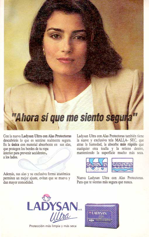
Ad for Ladysan Ultra con Alas Protectoras (menstrual
pad "ultra" with wings), (Readers Digest, 1994, Chile)
(similar or identical to Always ultra with wings)
The American company Procter & Gamble owns both Always pads and
Ladysan
(and Babysan, which like Ladysan sounds very
Japanese. As a kid in Okinawa I bought a cartoon book
by Bill Hume called Babysan about the American occupation of Japan and Babysan
meant, um, the women Americans GIs hook-, er, took up with. As a 13-year-old
I was mesmerized! ANYthing that explained women fascinated me! This museum,
MUM, is a recent effort at explanation.)
I assume "san" comes from Spanish sanitario,
sanitary.
In general, it seems that Latin American countries advertise menstrual
products more conservatively than most of the world and Tampax even had problems selling tampons there. But some European
Latin countries certainly found a wilder way (Italy
and France).
I thank the student who just started university in Chile for her
scans of this and two other ads!
|
Below: The lady - this is Ladysan, after
all - stares in a way reminiscent of the way the director told Greta Garbo
to stare at the end of one her movies. He told her (I believe) to think
of nothing.
A translation not of her stare but of the
text lies below the image.
|
 |
Translation from Google (rough in places):
"Now I feel safe"
With the new Ultra with Wings Protective you would discover how it
feels to be really safe. It is the only one with absorbent material on
its wings, which protect the edges of your underwear to prevent accidents
on the sides. Moreover, its wings and its unique anatomical shape allows
a better fit, prevents it from moving and gives comfort.
Protective Ladys Ultra with Wings also has the exclusive soft-dry weave
fabric which attracts moisture, absorbs faster than any other towel and
retained inside, keeping the surface much drier.
To make you feel safer than ever
Protection cleaner and drier
|
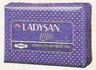
Below: The packaging in the ad.
|
 |
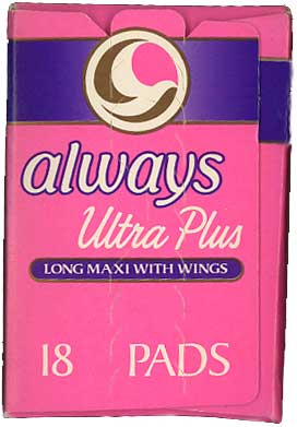
Below: Compare the bird
logo with the roughly contemporary American Always logo from a 1989
box, also a bird. The typefaces also resemble
one another. The close-but-not-identical characteristics possibly stem from
copyright considerations.
|
 |
 |
Below: While I had the American 1989 box
out I thought I'd show two things
from the back:
The amazing number of styles of pads (early
pads had one size) and
the amazing reluctance to make the blue line
- which represents menstrual blood flow -
brown or red. But they almost did, making
the two horizontal bars red.
A German ad from about the same time did it right.
Give them a hand!
Blue in menstrual advertising has been around
for decades. Hm: blue
(in America) also
means feeling bad. The darker the blue
line, the heavier the flow, the bluer you feel?
Seems like a public relations error to me.
|
 |
© 2010 Harry Finley. It is illegal to reproduce or distribute any
of the work on this Web site in any manner or medium
without written permission of the author. Please report suspected violations
to hfinley@mum.org
|